Notebook Paper Effect
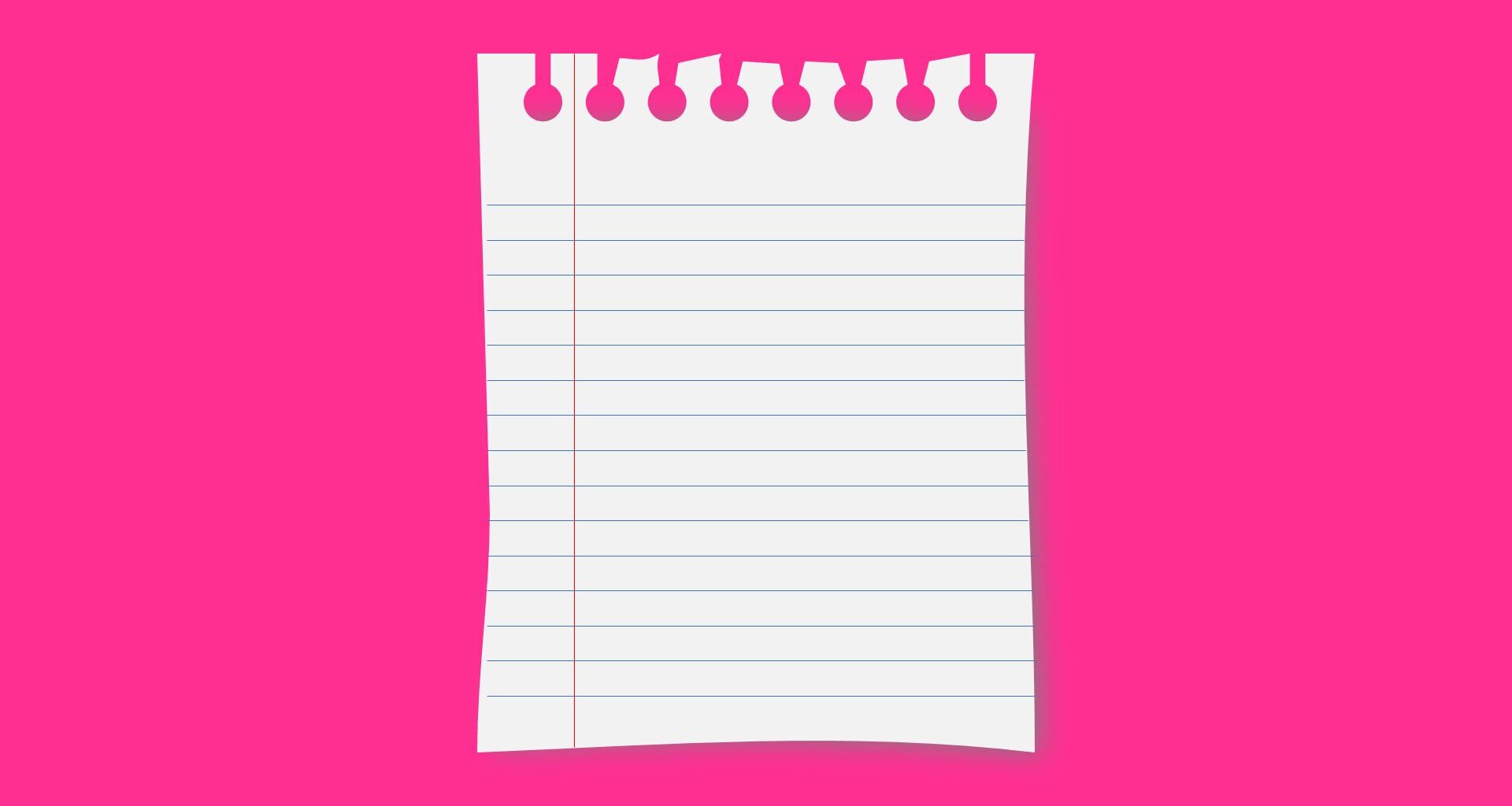
The notebook paper effect is a classic design element that simulates the torn appearance of paper commonly found in notebooks and notepads.
In this video tutorial, you’ll learn how to create an authentic notebook paper effect using PowerPoint and its combine shape tools.
Download the PowerPoint template
Here are some common use cases for notebook paper effects:
- Slide Backgrounds: Using torn or notebook paper graphics as slide backgrounds can lend a textured and realistic look. This is a great way to add depth and visual interest to the slides, making them visually appealing and engaging for the audience.
- Section Dividers: Torn paper graphics can serve as creative section dividers between different topics or sections within a presentation. Using torn edges or notebook paper elements to separate content creates a visual break and aids in chunking the information clearly and visually pleasingly.
- Image Frames: Another common way to use the notebook paper effect is for image frames or visuals.
- Handwritten Notes: Notebook paper graphics are a great way to create an informal tone in your presentation or course design. Instead of using basic rectangles to hold content, try using a paper graphic with handwriting font to give the design a more personal tone.
- Callouts and Annotations: notebook paper graphics can be used as callouts or annotations to highlight important information or key points on a slide. Placing text or visuals within a notebook paper graphic allows you to draw attention to a particular area or piece of content, making it more visually impactful.
- Creative Element Overlays: Torn paper or notebook paper graphics can be overlaid on other design elements, such as illustrations or charts, to add a unique and artistic touch. This layering effect creates visual depth and interest, enhancing the visual appeal and memorability of the presentation design.


