Combining Sliders and Masking Effects
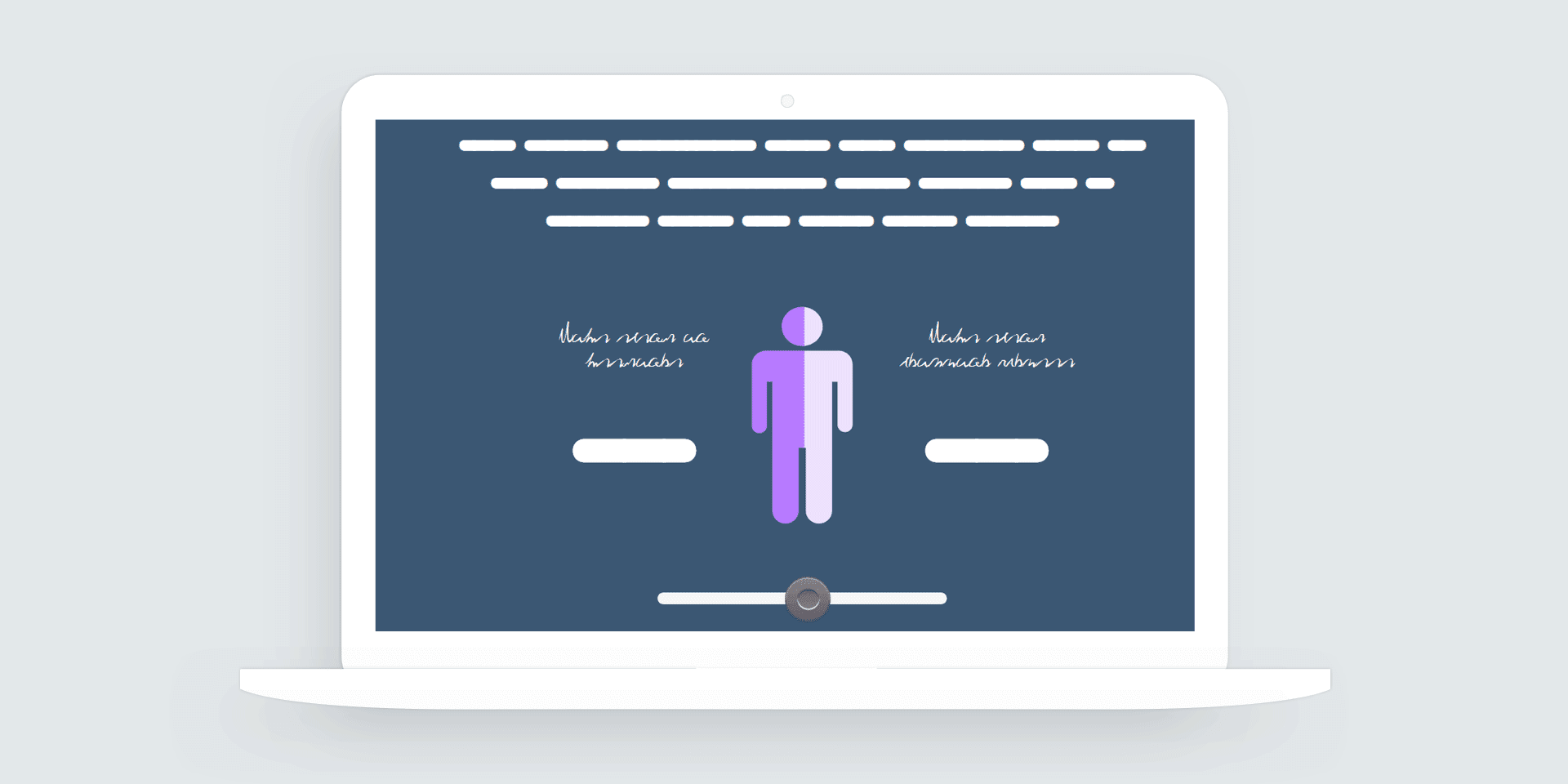
Storyline 360’s sliders are a great way to let learners explore relationships between two or more concepts. In a recent e-learning challenge #260, designers were asked to use sliders to create interactive infographics. To kick off the challenge, Articulate featured an example I’d shared earlier in the community.
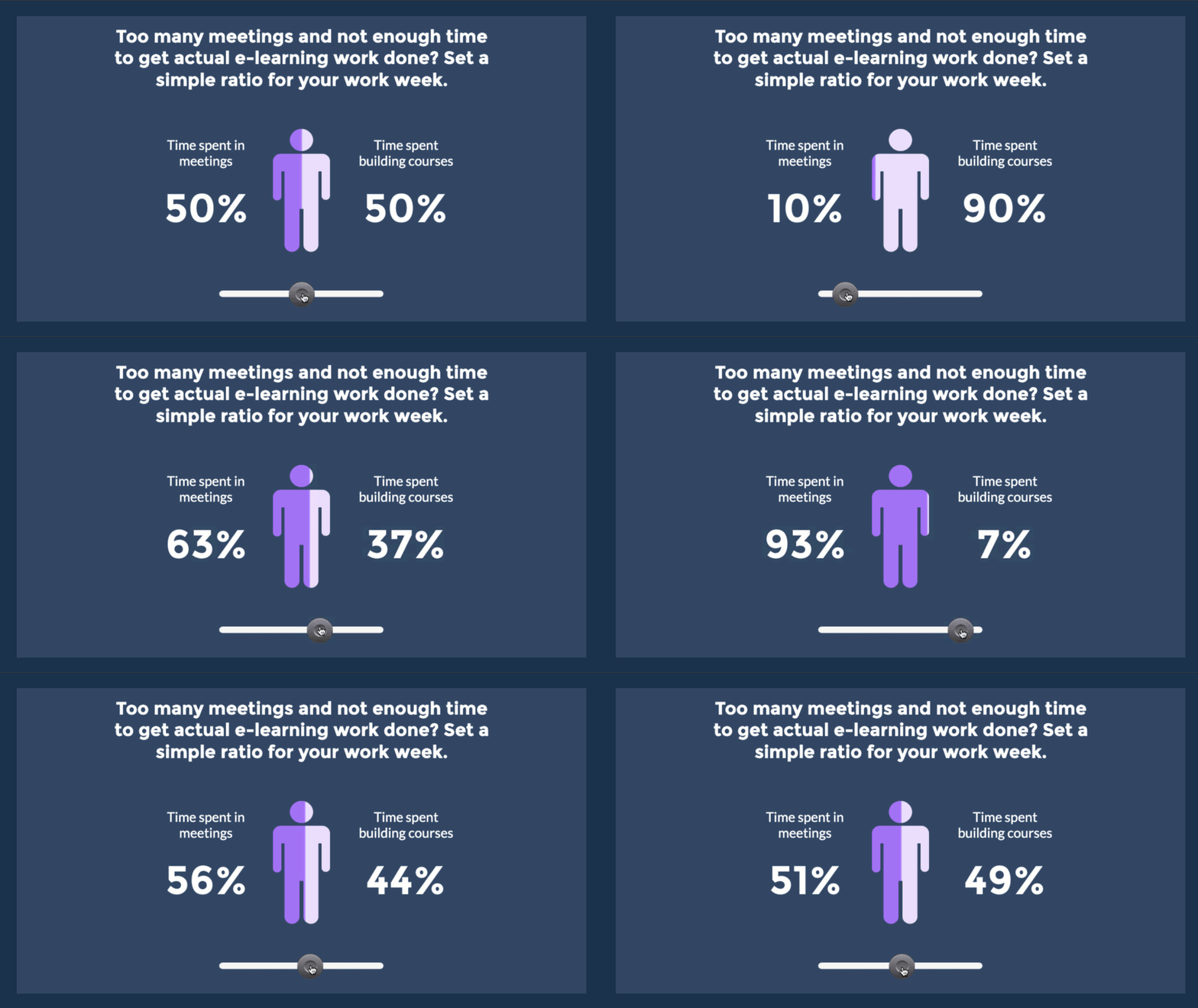
View the example | Download the source
What’s Going on Here?
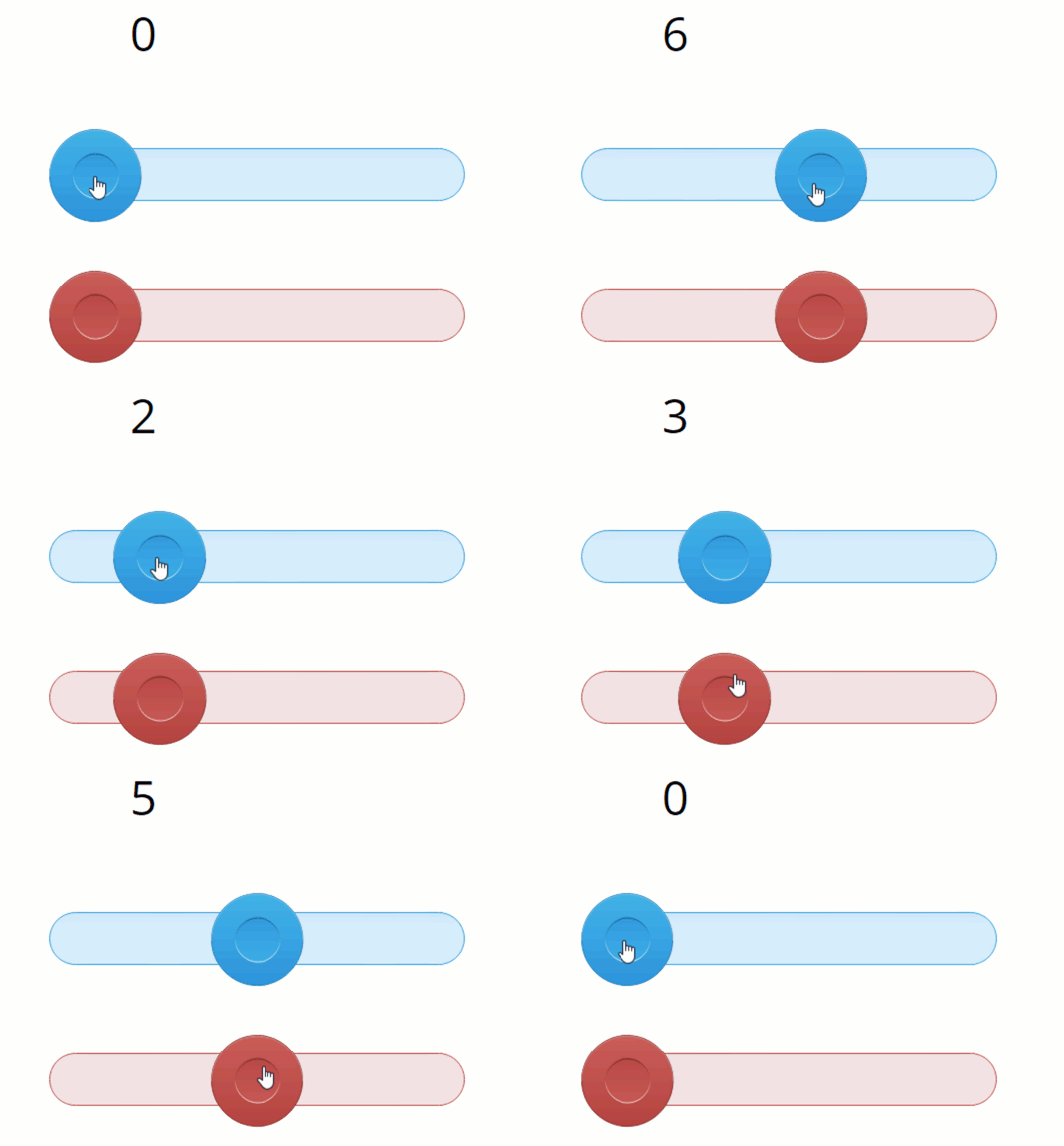
There are actually two sliders in this effect. The main slider you see on the slide and a second slider with a custom thumb fill used to fill the icon graphic.
Connecting Two Sliders with a Single Variable
Storyline 360’s sliders use variables. As you drag the slider, the variable is adjusted based on the step value you assign.
By default, each slider has a unique variable name. But you can set the same variable to both sliders. Using the same variable for both sliders connects the sliders. When one slider moves, the other moves.
Customizing the Slider Thumb
Storyline’s sliders are fully customizable. You can change the color of the slider thumb or replace it all together with a custom graphic or image.
To create the animated masking effect, I replaced one slider’s thumb with a custom rectangle graphic. The graphic needed to be saved as a .png because vector shapes can’t be used for slider thumbs.

The only thing left was to create the punch-out cover shape to hide the background and reveal the outline of the person icon.
Creating the Masking Cover Shape
To create the punch-out effect, I jumped into PowerPoint. Using a person icon shape, I placed the icon over a full-slide rectangle shape.
Next, I used PowerPoint’s merge shape feature to punch out the icon shape from the bottom rectangle. This creates a hole in the rectangle that will reveal what’s visible under the icon shape.
Another View of the Masking Effect with the Sliders
In this example, you can see how the combined sliders are used to create the masking effect.

Summary and Next Steps
Sliders are one of the best ways to create lean-in moments and get learners to touch the screen. Hopefully, this example gives you some ideas for ways to use sliders in e-learning courses.
You can download the source file from Articulate’s E-Learning Heroes community. If you have any questions about the effect or need help using custom sliders in your projects, please feel free to contact me.

