Interactive Stories with Photos
Can you design interactive stories using a single stock photo as a starting point? That’s the question presented in a recent Articulate e-learning challenge #322. The topic was inspired by a blog post and idea from Tom Kuhlman.
Check out the visual storytelling example and source file I shared in the challenge:
Download the Storyline 360 template
Interactive Stories with Photo Collages
Photo collages are loosely designed like comic book panels. Using a series of related photos, the collage adds visual interest to tell a story. What’s the story? Well, that’s up to you as the course designer to determine.
Photo collages come in two flavors: Portraits and action shots of people at work or in motion.
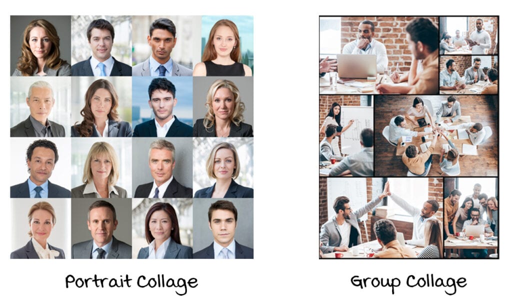
I like using the portrait collage style for “meet the team” and interactive org charts. The action and group shots style works well for interactive stories and transforming static text and bullets into interactions.
Using the stock photo as a starting point, you can convert the slide into an interaction using basic click-and-reveal techniques. Here’s a mockup of my original design concept:

Where Do I Find Photo Collage Images?
Try searching your favorite stock photo site for phrases like “photo collage” or “business collage,” and you’ll find hundreds of these collage-style images. Another keyword to try is “montage,” which iStock seems to prefer these days.
Pro Tip #1: Use Your Own Images to Create the Interactive Story
I scaled back my original design direction and went with a simple click-and-reveal interaction. The original image I found with the photo montage had some odd angles and close-up shots.
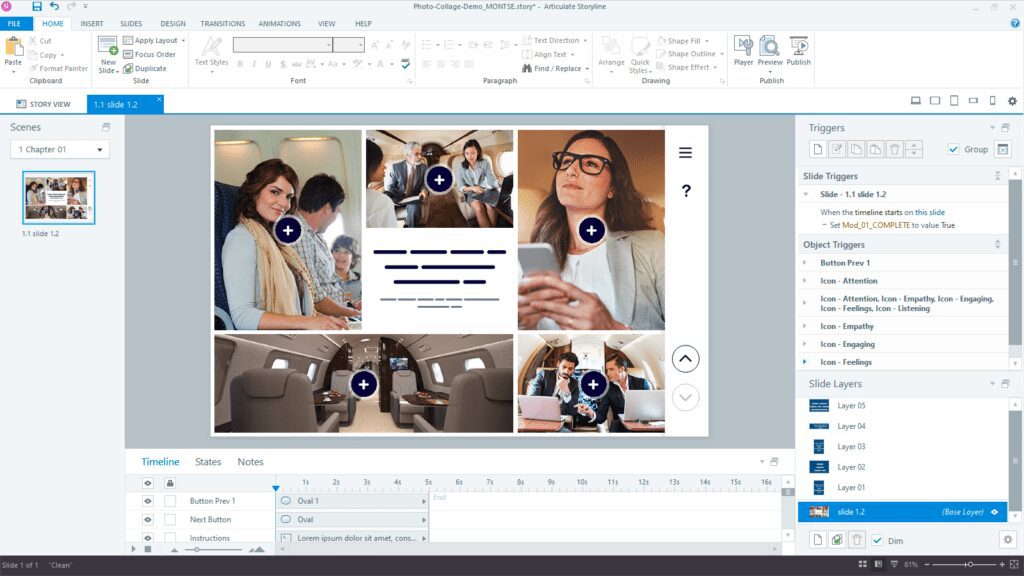
There’s nothing that says you can’t use the stock photo collage layout as the starting point for your own images.
After importing the image into Storyline 360, I traced each photo panel with Storyline’s rectangle shapes to use my own photos.
I think this still fits the spirit of the photo collage because the interaction uses similar action shots. I don’t like being limited by images that didn’t capture the desired effect.

Pro Tip #2: Create a Placeholder Template with Images
Storyline 360 makes it really easy to swap images at the slide level and with the Media Library.
Unfortunately, vector shapes can’t be swapped with bitmap images. I like the idea of having the option to use both. In the end, I saved each image as a .png image from Storyline and inserted the image back to use as my placeholder.
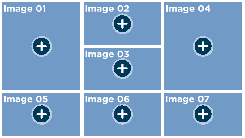
Pro Tip #3: Create Multiple Layouts
Consider building some additional layouts using your original photo collage as a starting point. Once you have the spacing established between images, you can resize your image or rectangle placeholders to create derivative layouts.

What Else Should You Know?
Interactive photo collages are easy to build and highly versatile. The stock photo montage drives your layout design. This helps you move quicker by removing some of the design decisions from your production process.
Try it out for yourself. The e-learning challenge is still going, so you have time to share your example. And if you have questions about my template or need help with your e-learning projects, contact me to discuss your needs.


