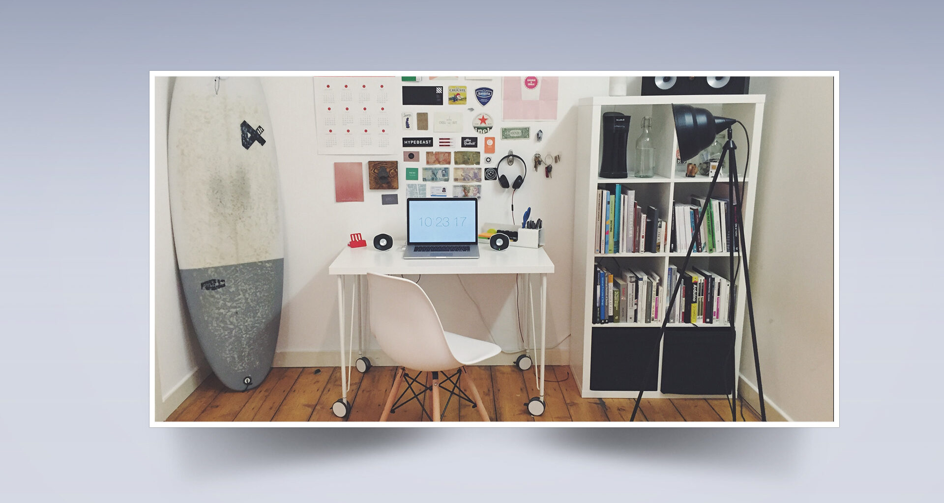
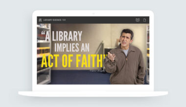
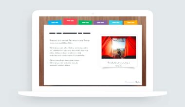
This week’s Articulate E-Learning Challenge #152 asked course designers to share their favorite image styles and effects. This was a fun challenge because I have a few image effects I use often in my projects.
Box Shadow Effects
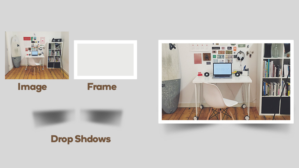
One of my go-to image styles and effects in the box shadow. This effect can be applied to one or more sides of an image. It’s a super easy effect to create and can give any image and slide design a sense of depth and texture.
Animated Photo Slider with Box Shadow
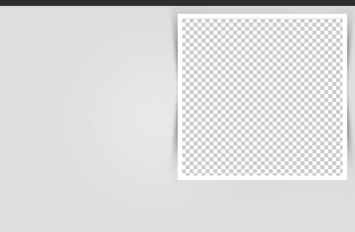
Here’s an example of how I use the box shadow effect. The animated images slide onto the slide under a custom cover graphic. The cover graphic has an area punched out to create a transparent area for each image.
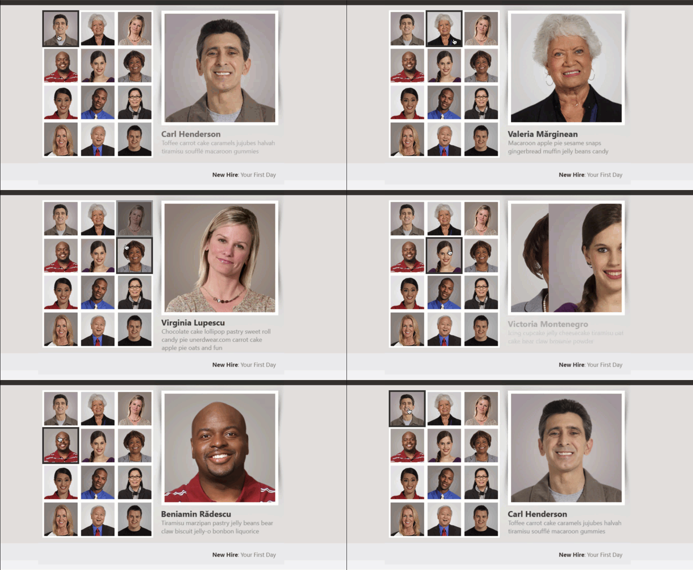
View this project | Download the Storyline 360 source file
Custom Cover Graphic with Transparency
I created the cover effect in Photoshop but this can easily be done in PowerPoint using the combine shapes feature. The idea is to create an area of transparency where the images will load beneath the cover graphic.
Animated Button Effects with Box Shadows
Here’s another example of box shadows I built for the David’s E-Learning Animated Button Challenge #89. In this example, the box shadow’s are applied to the button tabs. It’s mostly the same design effect. Only in this case, there’s no transparency required since the images animate onto the slide from the left.
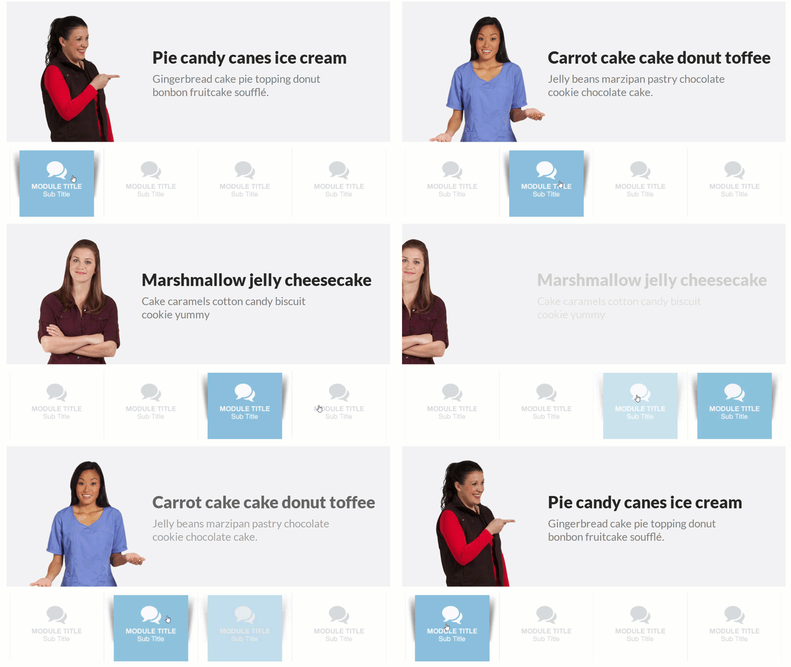
View the example | Download the Storyline source file
Summary
The box shadow effect is a fantastic image style that can be applied to any image or graphic on your slide. If you ever have any questions about creating this design effect, please feel free to contact me.

