This week’s e-learning challenge asked course designers to share creative ways to combine text and images in e-learning. I’ve always been a fan of overlaying text on images for course introduction screens so this challenge was a lot of fun!
Here are a few examples I’ve created for previous E-Learning Challenges.
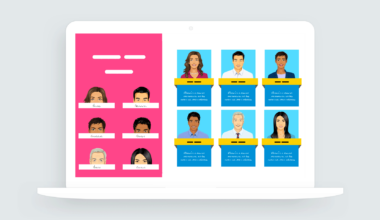
Adding Text in a Box
This simple technique creates contrast between the text and background.

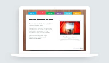
Another option for placing text in boxes is to use image containers that visually align with the slide design.
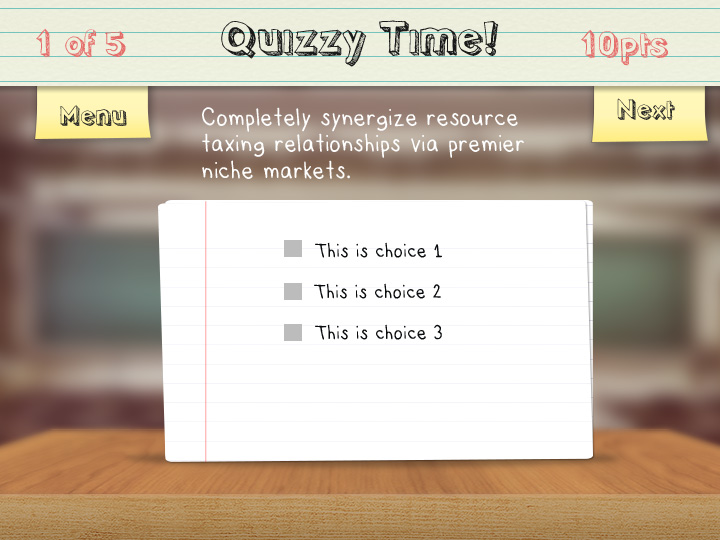
Lighten Image for Contrast
A quick way to create contrast between text and image is to lighten the background and use a dark color for text.
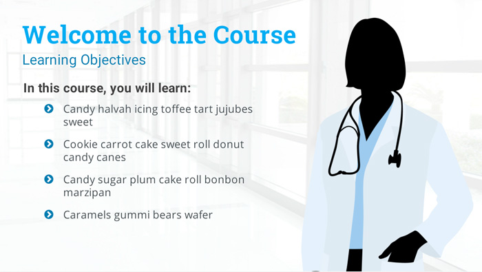
View the example | Download the Storyline file
Blurring the Background
Blurred backgrounds help to reduce visual noise and create a stronger contrast for your type. Here’s an example of using type over blurred backgrounds that I shared in a previous e-learning challenge.

Download 100 blurred background templates
Summary
Those are just a few ideas for using text over images in e-learning. If you have any questions about one or more of the examples I shared, please feel free to contact me.

